
People often say:
“Healthcare is serious business. You can’t joke around.”
Totally agree.
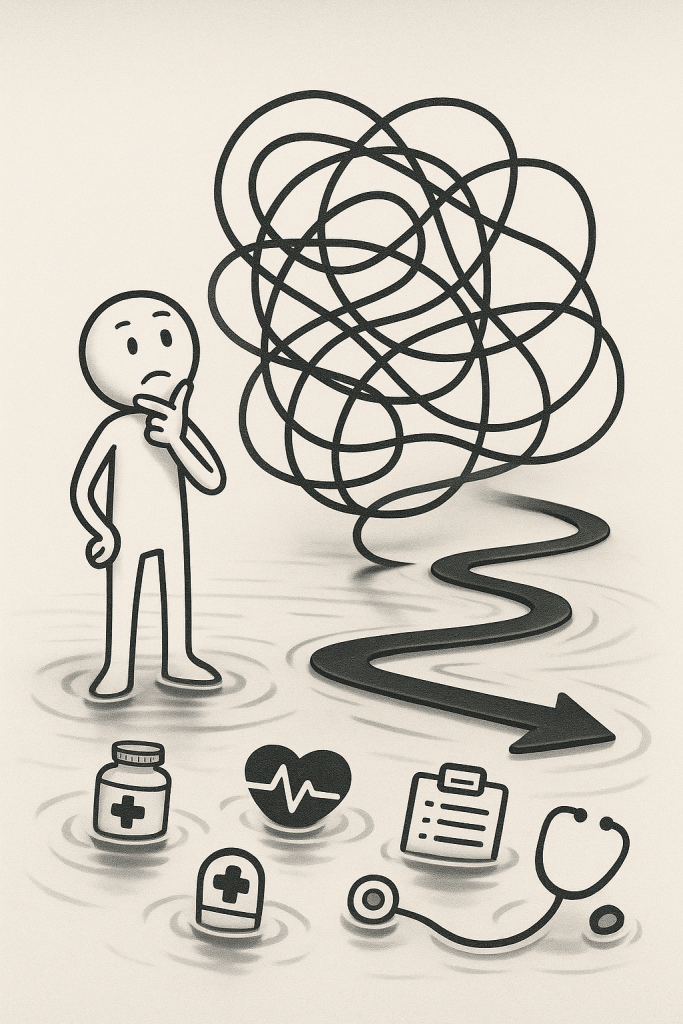
But try designing an actual hospital management app once — you’ll cry a little too. Not from joy.
𝗧𝗛𝗘 𝗣𝗥𝗢𝗕𝗟𝗘𝗠 𝗜𝗦𝗡’𝗧 𝗧𝗛𝗘 𝗕𝗨𝗧𝗧𝗢𝗡 𝗖𝗢𝗟𝗢𝗥 – 𝗜𝗧’𝗦 𝗛𝗢𝗪 𝗣𝗘𝗢𝗣𝗟𝗘 𝗔𝗖𝗧𝗨𝗔𝗟𝗟𝗬 𝗨𝗦𝗘 𝗜𝗧
When I first joined a healthcare project — an app for nurses and patient scheduling — I thought all I needed was:
💊 Clean UI
💊 Big buttons, clear flows
💊 Proper typography
Done, right?
Nope.
Our users – night-shift nurses, ER doctors, elderly patients – don’t have time to appreciate your “10px grid system.” All they need is: “quick to use – instantly understandable – no bugs, and that’s already a blessing!”
So that time, I stayed up with eyes popping out just to video call the BA over there and got to chat with this tough head nurse. She confided:
“You designed the emergency support button and it only shows up… on the third screen? If the patient stops breathing, we’d just stop using the app too.”
A few seconds of stunned silence — then enlightenment! I immediately told the BA to shadow a doctor during a real patient exam and record everything for me in every format: photos, voice notes, paperwork, from the reception desk all the way to discharge, abcxyz.
I asked very thoroughly: “What’s the most frustrating thing when using the app?” “This signature step — is it really necessary, or can it be automated?”
𝗕𝗘𝗖𝗢𝗠𝗜𝗡𝗚 𝗔 𝗟𝗜𝗧𝗧𝗟𝗘 𝗨𝗫 𝗗𝗘𝗧𝗘𝗖𝗧𝗜𝗩𝗘 (𝗠𝗜𝗡𝗨𝗦 𝗧𝗛𝗘 𝗠𝗔𝗚𝗡𝗜𝗙𝗬𝗜𝗡𝗚 𝗚𝗟𝗔𝗦𝗦)
Instead of guessing, I started:
🗝 Shadowing doctors during actual clinic hours
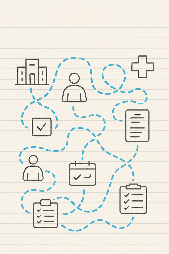
🗝 Mapping the real user journey — from reception to discharge
🗝 Asking one bold question: “What frustrates you the most?”
One response surprised me:
“Filling out long digital forms is more stressful than angry patients.”
(Valid.)
𝗧𝗛𝗘 𝗦𝗢𝗟𝗨𝗧𝗜𝗢𝗡𝗦 𝗪𝗘𝗥𝗘𝗡’𝗧 𝗠𝗔𝗚𝗜𝗖𝗔𝗟 – 𝗝𝗨𝗦𝗧 𝗣𝗥𝗔𝗖𝗧𝗜𝗖𝗔𝗟
After gathering user pain points, our team redesigned with real needs in mind:
🛎 Simplified screens – one main task per screen.
🛎 Designing for shaky hands – not pixel-perfect mockups.
🛎 Automated repeated entries – so users can breathe easier.
And most importantly:
✏ Test, test again, and test with real users (bonus points if you bring snacks).
𝗗𝗘𝗦𝗜𝗚𝗡𝗜𝗡𝗚 𝗙𝗢𝗥 𝗛𝗘𝗔𝗟𝗧𝗛𝗖𝗔𝗥𝗘 = 𝗦𝗪𝗘𝗔𝗧, 𝗦𝗧𝗥𝗘𝗦𝗦, 𝗔𝗡𝗗 𝗔 𝗟𝗜𝗧𝗧𝗟𝗘 𝗝𝗢𝗬
– It’s tough – because real lives and data are involved.
– But it’s meaningful – because every tiny improvement could make someone’s life just a bit easier.
Vietnamese edition: https://lnkd.in/dthXem-T


